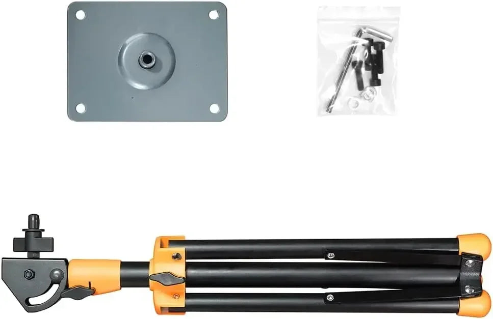
Mounting Stand For Percussion Instruments Electronic Drum Sample Pad Roland SPD-30 SPD-20 SPD-SX Yamaha EAD10 Alesis
Mounting Stand For Percussion Instruments Electronic Drum Sample Pad Roland SPD-30 SPD-20 SPD-SX Yamaha EAD10 Alesis
Regular price
$48.99 USD
Regular price
Sale price
$48.99 USD
Shipping calculated at checkout.
Quantity
Couldn't load pickup availability
Mounting Stand For Percussion Instruments Electronic Drum Sample Pad Roland SPD-30 SPD-20 SPD-SX Yamaha EDA10 Alesis
Compatible :Roland SPD-30 ,SPD-20, SPD-SX, Yamaha EDA10 , Alesis ,sample pad
Everything You Need For Mounting Multipad
Whether you're looking to take your multipad to your next live performance, or seeking to add on your percussion pad to drum kit, PPS-75 Mounting Stand is the answer.
This set is simple and easy to setup, comes with everything you need. Includes the iron stand, mounting plate, 4 pieces M5 screws and L type screwdriver.
Compatible with HXW PD705 Percussion Pad, Alesis SamplePad, SamplePad Pro, Sample Pad 4, Roland SPD and HandSonic.
From the brand
.aplus-v2 .apm-brand-story-carousel-container {
position: relative;
}
.aplus-v2 .apm-brand-story-carousel-hero-container,
.aplus-v2 .apm-brand-story-carousel-hero-container > div {
position: absolute;
width: 100%;
}/*
Ensuring the carousel takes only the space it needs.
The sizes need to be set again on the absolutely positioned elements so they can take up space.
*/
.aplus-v2 .apm-brand-story-carousel-container,
.aplus-v2 .apm-brand-story-carousel-hero-container {
height: 625px;
width: 100%;
max-width: 1464px;
margin-left: auto;
margin-right: auto;
overflow: hidden;
}
.aplus-v2 .apm-brand-story-carousel-hero-container,
.aplus-v2 .apm-brand-story-carousel-hero-container > div {
height: 625px;
}.aplus-v2 .apm-brand-story-carousel.a-carousel-container {
padding: 0px;
}
/*
This centers the carousel vertically on top of the hero image container and after the logo area (125px).
Margin-top = (heroHeight - cardHeight - logoAreaHeight) / 2 + logoAreaHeight
*/
.aplus-v2 .apm-brand-story-carousel .a-carousel-row-inner {
margin-top: 149px;
}
/*
Cards need to have a width set, otherwise they default to 50px or so.
All cards must have the same width. The carousel will resize itself so all cards take the width of the largest card.
The left margin is for leaving a space between each card.
*/
.aplus-v2 .apm-brand-story-carousel .a-carousel-card {
width: 362px;
margin-left: 30px !important;
}
/* styling the navigation buttons so they are taller, flush with the sides, and have a clean white background */
.aplus-v2 .apm-brand-story-carousel .a-carousel-col.a-carousel-left,
.aplus-v2 .apm-brand-story-carousel .a-carousel-col.a-carousel-right {
padding: 0px;
}
.aplus-v2 .apm-brand-story-carousel .a-carousel-col.a-carousel-left .a-button-image,
.aplus-v2 .apm-brand-story-carousel .a-carousel-col.a-carousel-right .a-button-image {
border: none;
margin: 0px;
}
.aplus-v2 .apm-brand-story-carousel .a-carousel-col.a-carousel-left .a-button-image .a-button-inner,
.aplus-v2 .apm-brand-story-carousel .a-carousel-col.a-carousel-right .a-button-image .a-button-inner {
background: #fff;
padding: 20px 6px;
}
.aplus-v2 .apm-brand-story-carousel .a-carousel-col.a-carousel-left .a-button-image .a-button-inner {
border-radius: 0px 4px 4px 0px;
}
.aplus-v2 .apm-brand-story-carousel .a-carousel-col.a-carousel-right .a-button-image .a-button-inner {
border-radius: 4px 0px 0px 4px;
}
Experts in electronic percussion area, HXW provides solutions for enthusiasts all around the world. Deliver you the nice products and service directly.